
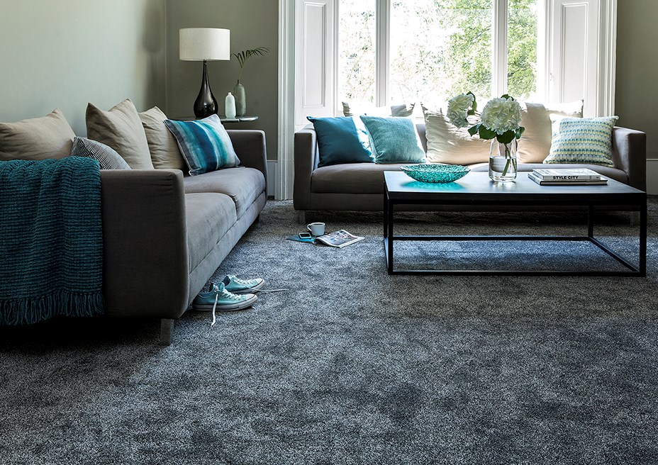
Let’s break it down, how does this room work?
The Soft Focus Heathers carpet in Anthracite, has a lovely pile that changes colour depending on the way it’s brushed, this gives it light and dark qualities and creates an illusion of depth and a subtle tone to build the room around.
What are the main accent colours and how do they blend so well together?
The room has a dark grey carpet and dark grey sofas, this means that whilst it isn’t a jarring contrast, the walls can afford to be lighter and they will still work well because they are muted. For this room set we used Manor House Gray from Farrow & Ball, it’s a light colour but it isn’t bright or garish, it blends in with the tone of the carpet and the sofas, which gives the room a feeling of tranquil calm.
What stops the room from looking boring or drab?
Well! This is the interesting part and where styling, chemistry and know-how really comes into its own. With the carpet, walls and sofas as the starting point, you can start to introduce accent colours that highlight and lift the scheme, giving the room the feeling of soft summer freshness. Light and dark teal with soft sage greens in the form of cushions, vases and bowls add impact to the room and splashes of white punctuate the scheme harmoniously.
STYLIST’S TIP: Fresh flowers or really good faux flowers are essential for bringing a room to life – for really good faux flowers try Rockett St George, Abigail Ahern or Bloom.
STYLIST’S SECRET: The power of 3….if you look through a home interest magazine at decorating features and room sets ….you’ll notice that accessories are styled together in sets of 3….it’s a magic number! It’s no coincidence that there are groups of 3 on each tabletop in this image!
STYLIST’S COLOUR NOTES: Other paint colours that would work well with this carpet colour are, Hardwick White and Purbeck Stone also from Farrow & Ball.
Let’s break it down, how does this room work?
So, like the other room the Gemini carpet in Cosmic Ray is essentially grey – this is a lighter shade but it’s still grey. Some people might think that’s a brave choice…..but in reality, it’s not only practical but also warm and scene setting.
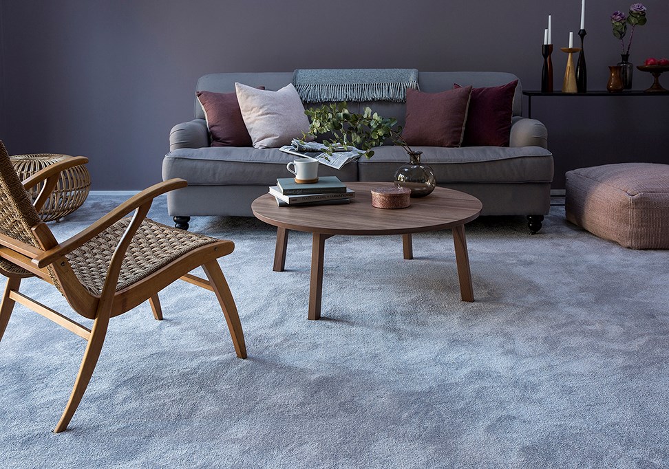
So, what’s the difference between this room and the other room set?
Well, this room is a slight reverse – in this room set the floor is muted grey and the walls are a dark spicy mulberry coloured paint called Brassica from Farrow & Ball. It’s the same principle as before but just changed around and the overall feel is harmoniously balanced by using lighter grey furniture elements to blend with the carpet.
How does the room feel light even though the accessories are dark?
By using a pale grey carpet and sofa and darker walls the overall scheme still feels light and this is enhanced by the use of the mid-century wood furniture. The colour is mid-toned and that means that it’s possible to be more dramatic with the accessories, such as the dark cushions, dark wooden candlesticks and black console table – it’s all about creating a visual and aesthetic balance, in this case with a slightly scandi feel.
STYLIST’S TIP: Play around with textures if you’re feeling confident! This room is full of carpet, upholstery and cushions which are soft and comforting - in complete contrast – try adding another texture. In this case, smooth wooden vintage furniture has been used to create an effortlessly stylish room that takes it to another level.
STYLIST’S SECRET: Create a visual feast by leading your eye around a room. If you look at this image - see how your eye naturally follows from the candlesticks to the coffee table to the rattan footstool and then back to the chair in the foreground – this works in real life and is called creating visual harmony. Try it at home – you’ll be surprised at how you can mix it up to make your room flow more naturally.
STYLIST’S COLOUR NOTES: Other paint colours that would work well with this carpet colour are, Downpipe and Preference Red also from Farrow & Ball.
If the thought of jumping in at the deep end is too much of a plunge, go for a paler grey carpet and then perhaps paint the walls a similar tone, this will provide a neutral background. Then, to add contrast, paint just one wall in a darker tone to create a ‘feature’ wall.
If you’re a little apprehensive, choose furniture in the paler neutrals so that it matches the carpet. As you grow more confident with the scheme, you can introduce darker cushions, rugs and other accessories to add some drama and when you’re feeling really brave – paint the other walls to match the feature wall.
Above all, have fun with your interior design – remember keep the carpet and the basics paler if you are feeling out of your depth and then enjoy being bolder and more adventurous as you introduce darker hues to the scheme!
Use our free carpet sample service to get three of your favourite options delivered straight to your door, or find your nearest Cormar retailer and pay their showroom a visit.
")
")
