Samples
0

Stylist Notebook 2: Modern Vs Vintage

Modern Vs Vintage

Imagine you could choose any bedroom style you want – the look is entirely up to you. You can literally start from the drawing board and create the haven or sanctuary that you’ve always wanted…a little space that is exclusively yours for sleeping, chilling, relaxing and that all-important – ‘me time’.

Sounds good, doesn’t it? But how do you go about creating a scheme? How do interior designers come up with ideas? Where would be the starting point? How do you get inspiration and know what colours to choose? We asked leading interior stylist Jess Contomichalos for some style pointers and to explain how she came up with two very different bedroom sets for our recent photoshoot.

Moody Blues

This room is very dramatic – it’s brave with colour and texture and has a modern vintage twist with contrasting textiles.

But, how do you even start to create this kind of look at home? 

To create an opulent look in your bedroom, you need to be careful with your choices and especially with your base colours which will form the canvas on which to build the room’s colour scheme. Deeply dramatic colours are a fabulous way of creating mood in a room but they need to be balanced with lighter colours, or the effect can be oppressive and suffocating. These lighter colours also need to be considered carefully, if they are too prominent, you will dilute the impact of the darker colours.

So, let’s have a look and see how this room works and why…

The brief for this room set was to create a bedroom that was not only striking and bold, but it also had to be beautiful, with sumptuous bed linen and luxurious throws. This had to be a room you would want to own, with the sort of bed you could sink into whilst being cocooned in the surroundings.

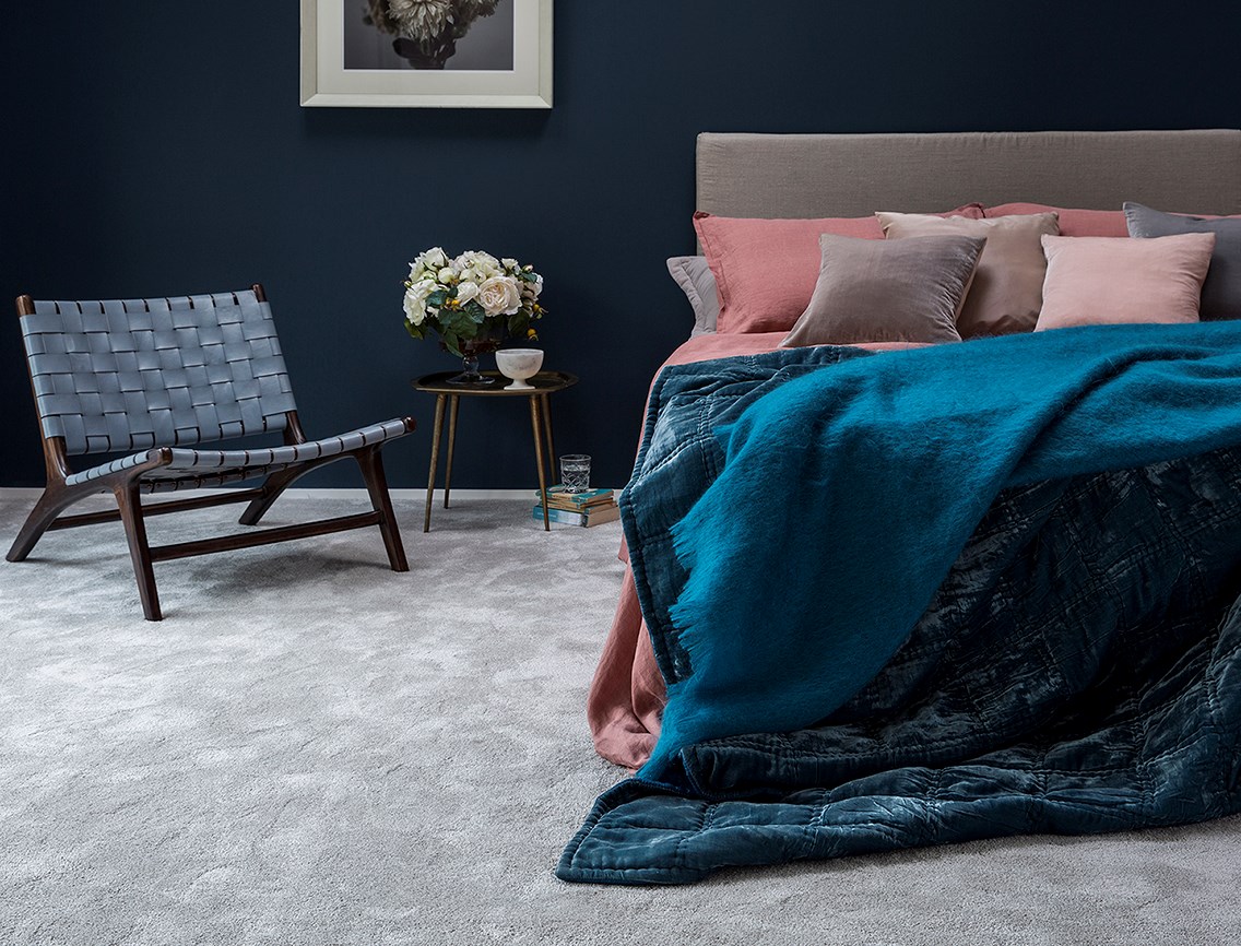
The starting point for the room was the deep pile, Cormar’s Sensation Heathers carpet. This was the perfect flooring solution as not only is it soft underfoot, but it also has a deep velvety pile that imitates the look of silk carpets and therefore projects a very grand feel. By choosing the colour Riga Surf which is a soft, light silver grey floorcovering, there’s now scope for the walls to be the complete opposite, rich and more intense in colour. Any rich deep tone would work but in colour psychology, blue stands for peace, tranquillity, calmness and serenity – all of which are ideal qualities in a bedroom. The walls are painted in an inky blue, the perfect colour contrast for the silvery carpet, which, when combined provide a stunning backdrop for the bedroom furniture and accessories.

There’s a blend of old and new in this room set – how do you achieve that without something looking wrong or out of place?

Styling tricks of the trade can be learnt – which is great news for anyone out there feeling a little timid or scared to be adventurous. Whilst it may take some time to gain confidence in your interior design style, the more you experiment – the quicker you’ll be up and running.

Creating a successful mix of modern and traditional elements in your room is hard to achieve, but not impossible if you follow a simple rule – only use one era to back reference to. So, in this room set, believe it or not, it’s the 50’s. Have a closer look at the room, the table and chair are Mid-century Danish (typical of the ‘50’s) and the cornucopia of flowers and marble footed bowl are classic 1950’s English country home style. The print is also a 50’s floral image but a contemporary frame brings it into this decade. A very contemporary plain suede headboard creates a perfect ‘stage’ for the soft furnishings on the bed. Pale pink and strong blues are colours associated with the 50’s too. So, soft, blush pink linen bedding and rich, textural cobalt blue velvet and mohair throws work beautifully together and are also evocative of that era but have a linear style that brings the look bang up to date.

STYLISTS TIP: Creating a room like this works best if you stay away from patterns and textures – there’s already so much going on with the intense walls, the luxe carpet and all the textures. Keep the colours plain and bold and avoid fussy patterns.  

STYLISTS SECRET: Make a real statement with smaller accessories by keeping them monochrome  this room works really well because the colour is key and the black and white accessories merely highlight the other colours within the scheme.

STYLIST’S COLOUR NOTES: Other paint colours that would work well with this carpet colour are, Bobble Hat and Toy Soldier from Earthborn Paints.

True Blue

This bedroom is bright and airy unlike the other room set. It is decorated with layers of texture, accessories and a contemporary vibrancy that makes it totally different.

This room looks so much simpler in style but it’s actually more cluttered. The Primo Choice carpet from Cormar in the colour Zinc, is a similar colour to the Sensation Heathers above, so how can it appear to be so light and fresh when there’s so much going on?

Well here’s an interesting and less obvious designer trick! This is the perfect example of light and colour reflecting around a room. In this bedroom the light hits the walls and together and most importantly with the carpet, they act as reflectors which help to bounce light around the room. In the other bedroom scheme, the light breaks through but gets immediately absorbed by the blue wall – so there is nothing to bounce light from wall to floor so the effect is very different. Despite this lovely room having far more accessories and layered bedlinen – it still appears bright and fresh – if you were to put the same amount of interest in the darker room – it would look cluttered and confusing - your eye wouldn’t know where to look first.

The colours in this set seem to be an unusual choice – how come they work so well together?

The colours in this room set do look like an unusual choice – but this is where colour crunching comes in. One of the first things you get used to as a stylist is how to use the colour wheel. Guess what is the opposite of turquoise, duck egg blue and teals on the colour wheel? Yup! You guessed it – coral, orange, gold and tan!. So, whilst they may not be your obvious choice, they complement each other beautifully – it is just colour science at its best! A beautiful fresh blue wall is the ideal backdrop for the tan coloured wooden side table and headboard. By introducing terracotta to soften the tones and bridge the gap between the blues and browns, the finishing touch is to use black and white around the room to finally bind the scheme together properly. In this case it’s in the framed prints and the soft black and white throw on the bed. Essentially, it’s really just a fascinating combination of colour mixing chemistry, once you’ve got the hang of it – it’s simple!

STYLIST TIP: Green plants and succulents are an absolute must in any contemporary scheme, they project something different to flowers and blooms as they’re more sculptural and but bring a sense of life to a contemporary room scheme.

STYLIST SECRET: If you want to create a stir – study the colour wheel and remember opposites attract! Experiment by using tester pots to create colour combinations and then you can decide which colour you want on the walls and what you will use elsewhere, it will give you a clear vision of which colours work together!

STYLIST’S COLOUR NOTES: Other paint colours that would work well with this carpet colour are Polka Dot and Milk Jug from Earthborn Paints.

Feeling inspired? Whatever the look you’re going for make sure it’s a style that you’ll be able to live with, you need to stay within your comfort zone or the scheme will be short lived. Once you’ve chosen your basic colours, you can start to think of furniture options that go with the look you’re creating. Always remember to take your time and think things through carefully – one careless purchase could compromise your room’s look completely. Head over here for more information about carpets specifically designed for bedrooms and remember - have fun creating your perfect bedroom space!