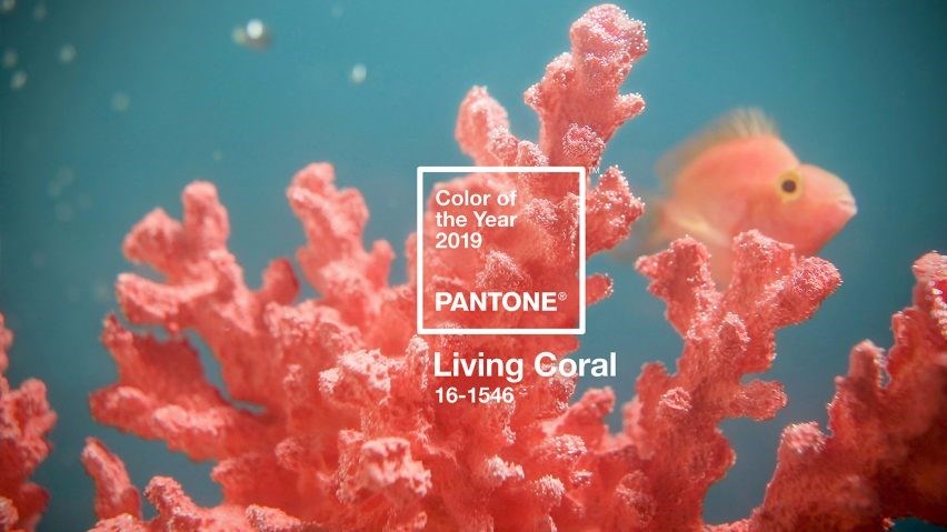
It’s the news the fashion and interior worlds have been waiting for. The announcement from Pantone, the global authority on colour, on its 2019 ‘Colour of the Year’.
And the shade we will all be hankering after is...Living Coral!
New Jersey-based Pantone picks a new colour each year based on socioeconomic conditions, fashion trends, new technologies, as well as new trends in the realms of lifestyle, art, music, travel, and of course, social media.
It has chosen the peachy orange shade because it is an “animating and life-affirming coral hue with a golden undertone that energises and enlivens with a softer edge”. It is meant to reflect the “innate need for optimism and joyful pursuits” as a response to social media and digital technology.
At Cormar, while we don’t envisage homeowners rushing to put a coral coloured carpet down just yet, we do see the shade being used in furnishings and decorative accessories to complement silvery grey carpets such as our super soft Sensation range or easy-clean Primo Plus.
So how can we use this shade in the home?
The muted terracotta tone is more practical than the 2018’s slightly more challenging Ultraviolet colour. It adds a flush of warmth, a pop of colour and is a softer alternative to a bold red or zesty orange.
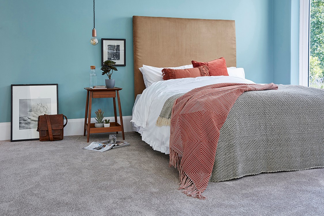
Living Coral also works particularly well with the blue colour family especially accents of soft aqua hues – very ocean like. Complement with teak wood furniture for a comforting and nurturing feel to a living space.
What are your thoughts to 2019’s ‘Colour of the Year’?
")
")
