As Dulux announce their Colour of the Year 2020 – Cormar are, as always ahead of the style game!
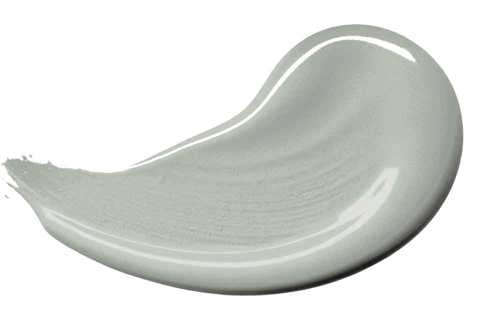
Described as “that colour that lies between the land and the sky on a misty morning” by Marianne Shillingford, Dulux’s creative director, it’s not hard to see why 'Tranquil Dawn' (pictured right) has made it to the top of their list.
After around 18 months of research, looking at not only fashion, architectural and interior design trends but also and more importantly the socioeconomic factors, consumer buying trends, where are we travelling and what do we want and need most.
In our current climate, it would appear that we want the world to stop fast-forwarding, go back to basics and re-charge. This colour it would seem can bring us the peace and tranquillity that we crave.
Here at Cormar, we strive to be on-trend and seem to have been ahead of the game when we used the colour for one of our shoots recently for our Soft Focus Heathers range…
We needed a muted tone that was easy on the eye and would go with almost anything. As we were using a dark carpet we needed a wall colour that would help create a feeling of space. This particular shade of green is receding which means it makes a room look bigger and feel light and airy when you’re in it – providing the perfect balance for one of our Soft Deep Pile carpets in a deep charcoal shade.
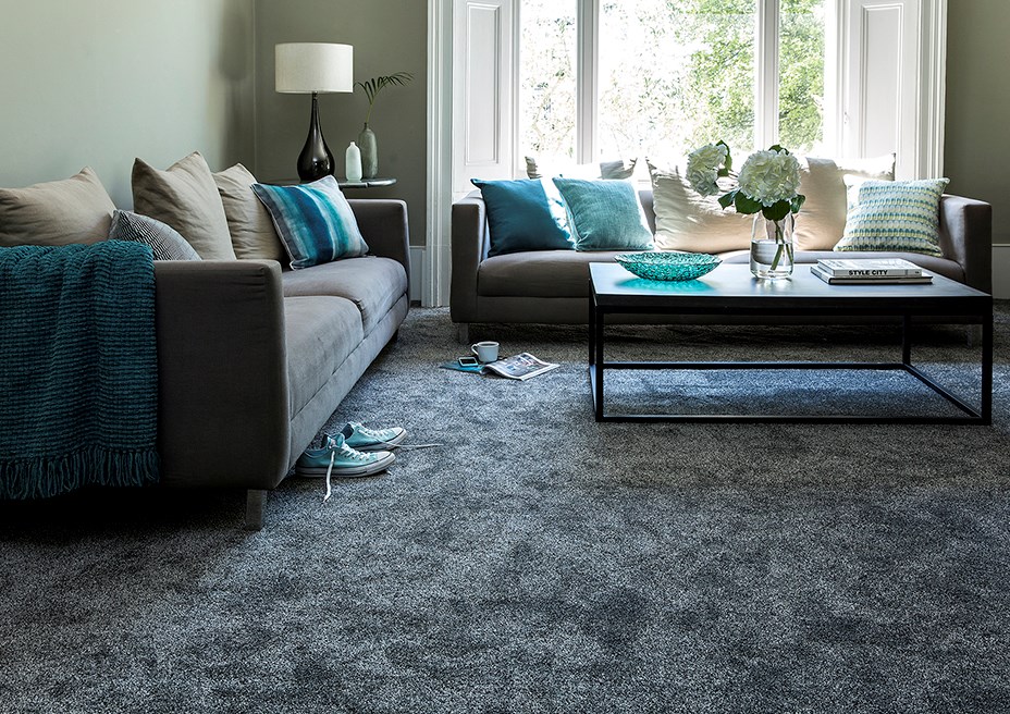
Surprisingly enough, this green goes with almost anything! The pale tone is a great base for pale pastels, autumnal colours, dark and pale wood elements, white and black and many more combinations too! If you look at our room set you can see for yourself that the walls adapt to all areas of the room, the carpet, the sofas, the dark wood table and at the same time the white lampshade….and creates the perfect backdrop for the teal, turquoise and navy accents.
The room feels calm and peaceful – is that down to the colour alone?
It is a very serene colour which does set the scene. The idea behind choosing Tranquil Dawn was because of the general desire in this fast-moving world to reconnect with the human touch and allow us all to create a feeling of wellbeing in our homes. This shade of green certainly succeeds in doing that – so yes, I would say the hazy green colour sets the mood.
We wanted to create a room that was welcoming and warm but most importantly we wanted to showcase the tactile carpet. It can be harder to show a dark carpet working well as obviously lighter carpets are more neutral which means you can be more adventurous with the wall colour and accessories. So, by choosing Tranquil Dawn, and creating a neutral base, we were able to balance the carpet colour by drawing in the various tones of all the elements together to create a harmonious scheme.
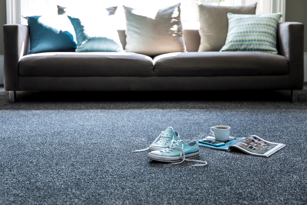
If you look closely you’ll see that the sofas are a paler but similar tone to the carpet, as is the coffee table, which is gentle on the eye with pops of teals and blues inject the room with interest. Then we used soft beige and ecru to bridge the gap between the green wall and the charcoal carpet…and hey presto!
The effect is one of pure tranquillity and testament to the creative powers at Dulux who have researched the colour and offered us this therapeutic option – get your paint brush out and give it a try!
")
")
